
“Users desire more complex and diverse experiences”: Samsung offers insights into its UI 3.1.1 mobile software
Last year, Samsung updated its One UI 3.1.1 software, with the One UI 4.0 Android 12 beta program being launched in September 2021. In November, the UI 4 software reached devices like the Galaxy S21 series, with a range of new design enhancements and features.
Samsung recently offered key insight into its One UI 4 software, sharing details on user experience and brand identity via the company’s newsroom. The information could help guide consumers, and perhaps other brands, to make a dynamic user interface for electronic products.
UI 4 is a “seamless mobile experience”
Samsung designed One UI 4 to have a brand identity that reflected a “seamless mobile experience”. This would, in turn, be consistent throughout different Samsung devices, as well as through different applications and settings.
“The delicate yet flexible elements of the interface help users freely express their individuality while providing the tools to make everyday life more convenient and secure”, the company explained in a statement.
Redesigning the user interface
A notable part of Samsung strategy when designing One UI 4 was to make the interface simple and streamlined. This was so users could focus on “what matters most”, with a visual hierarchy intended to guide users to the most “important” elements or features on a page.
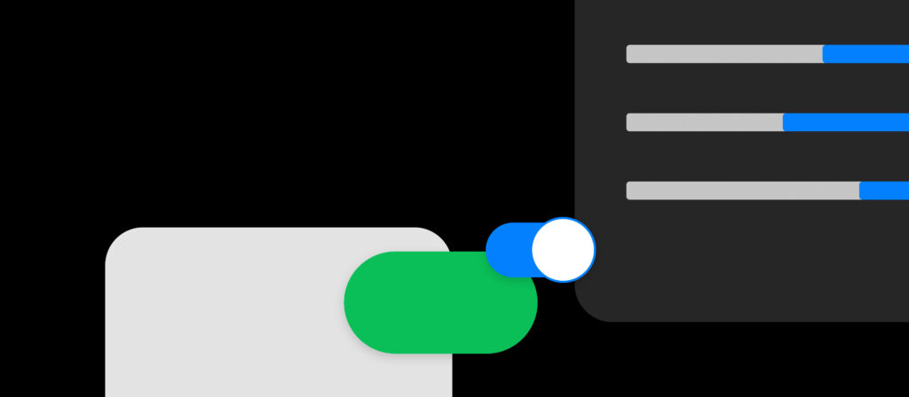
One way Samsung approached this was by simplifying the colour scheme. Colour buttons have been added to on-screen info that is deemed most important, with less integral info in more neutral colours. Certain colours, like red, have been allocated with “negative” actions like Delete or Stop, while green has been used for more “positive” actions like Approve or Accept.
As well as this, Samsung’s font for devices was also redesigned. The font size and thickness of the on-screen text has been changed, with the intention to create “optimal negative space”. Again, font size is adjusted depending on the “importance” of the information presented.
The results of these changes? What Samsung calls a “clearer and more cohesive visual experience” for the user.
Samsung’s new UI also uses “cards” so that users can quickly understand facts and figures from their device. Phone data is categorised into layers, so that users can check through their device and understand what information is a priority.
How UI can help boost consumer confidence regarding data and privacy
One UI 4 was designed to partly address consumers’ concerns regarding data and privacy in the modern era. A specialised “Permission Dashboard” has been introduced to devices. This feature tracks just how often one’s camera, microphone and location data has been used, and where. The dashboard is also able to analyse and block apps that request invasive permission for your personal information.
A subtle feature that also addresses these issues is having icons appear when the camera and microphone are being used by an app. This is so users can understand exactly what their phone is being used for at any given moment while using a specific app or even when the app is inactive.
Customisation to appeal to customers’ creative side
Samsung has embraced the customisation of its devices with One UI 4, offering even more customisation choices and features. Users can create unique backgrounds, while the Colour Palette allows users to select the visual theme of the device, making it another extension of self-expression. This is done by using five colours from the wallpaper the user chooses, with these colours informing the entire visual look of the device.
Settings like dark mode appear to give users the choice to reduce visual fatigue down to the smallest detail.